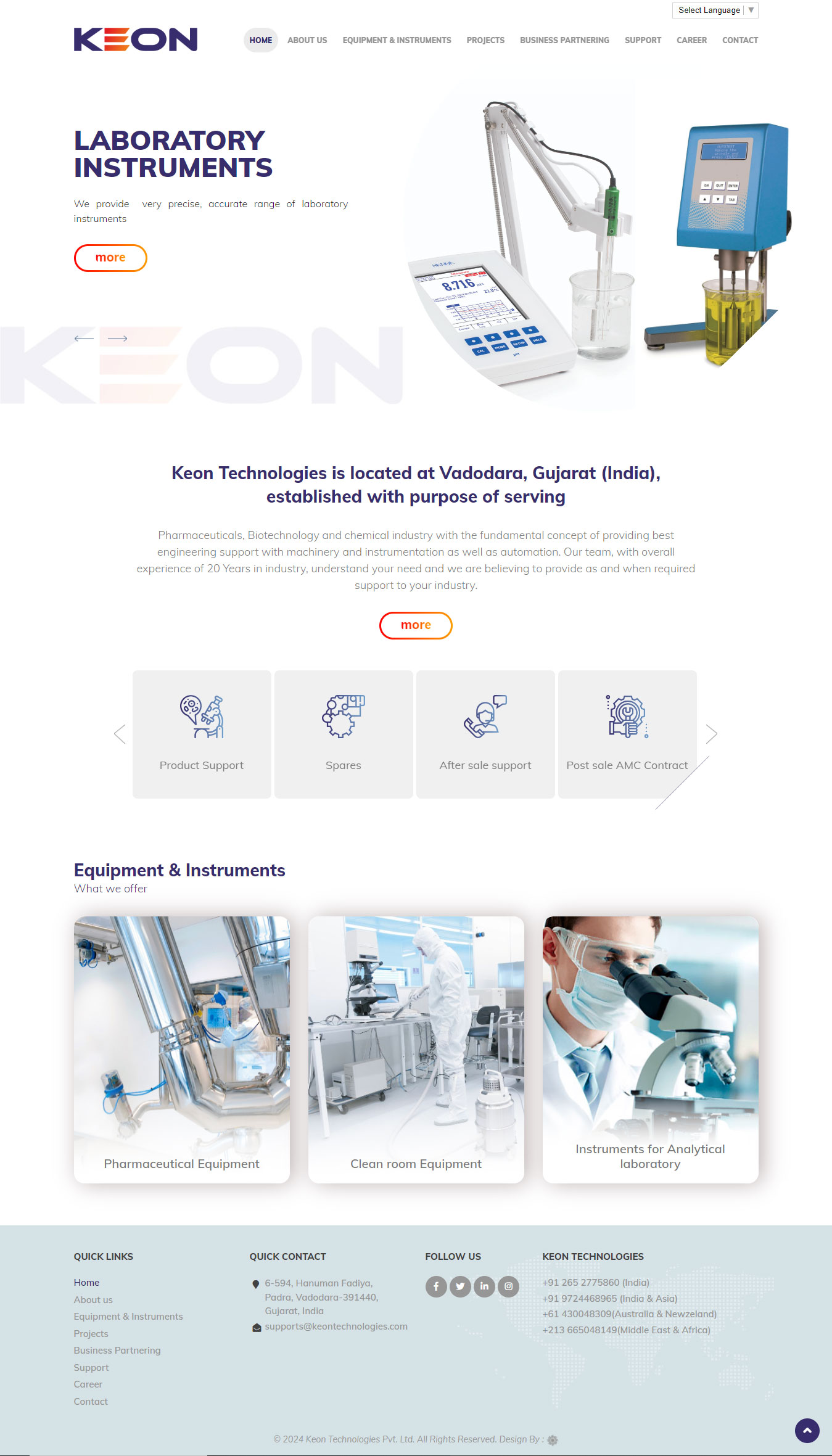
Keon Technologies was established in 2004 to help chemical, pharmaceutical, and biotech companies with equipment, training, and support. The company provides pharmaceutical equipment and machinery for packaging and production of liquid injections, dry powder injections, ophthalmic and nasal sprays, tablets, capsules, and ointments. Their laboratory equipment range includes weight balance, viscometer, pH meter, osmometer, and more. Apart from medical instruments, they also provide clean room equipment for laboratories and hospitals and packaging machinery, specifically targeted for the pharmaceutical industry.
Looking For Custom Web Development Solutions?
When Keon Technologies started in 2004, there wasn’t a requirement for a website. Digital marketing wasn’t a popular means of advertising and marketing two decades ago. Things have changed, and today everyone looks for products and services online. With changes in technology, it was imperative for Keon Technologies to adapt. Keon Technologies’ old website was good and portrayed their products. The portfolio website was an online brochure with products and short descriptions. It lacked branding and a clean interface. Very importantly, the website was not responsive. With over 70% of the country using the internet on a mobile phone, it was important to make the website mobile-friendly and responsive.
The Problem
Faced with challenges on the digital side, Keon Technologies approached Megh Technologies for a solution. The key requirements of Keon Technologies were:
- Complete website redesign, custom business web design
- Mobile-first design: The website had to be responsive, mobile-friendly, and accessible on all devices, but more importantly on mobile phones
- Interactive design: Microanimations for a good user interface (UI) design and a good user experience (UX)
- Content management system: For easy addition, deletion, and modification of content without intervention from a third party
- Cross-browser compatibility: Should be working on iOS (Safari) and Android browsers (Chrome)
- Digital marketing integration: Should integrate with social media for sharing content and optimized for search engines
- Web performance optimization: Should be fast on mobile phones and desktops.
Solution
Megh Technologies understood the requirements and conducted a thorough analysis of the current website, checked the content, images, and the web hosting company where Keon Technologies had hosted their old website. We had a detailed discussion with the stakeholders on their expectations of the website, their audience, and the current website traffic. We also analyzed the competition and conducted detailed target audience research.
Our reports were presented with a proposal to recreate the entire website in phases.
Wireframe and Prototyping: With the report in place, we created a detailed site structure and a wireframe of the website. The wireframe was a barebone structure of what the website would look like, the structure of the website, and the content required. A short discussion which followed the wireframe ensured that we were aligned with the business needs and goals of the company. Once approved, Megh Technologies was asked to create a prototype.
The Prototype: The website required a content management system, but the company was clear that it required content to be changed only on certain parts of the website. The website was mostly static with very few modules that required updating or addition. The changes were rare (usually once a year). This did not warrant the need for WordPress or a full-fledged content management system. Keon Technologies agreed to the same too. A custom content management system was created for the purpose with a secure backend admin section. The website was designed with web animation, custom website navigation, web accessibility features, web typography, etc. The website technology included HTML5, CSS3, and JavaScript frameworks. As required by the client, the website was designed with a mobile-first approach, ensuring that it was mobile-friendly and responsive.
The Results

The biggest response was for the design, and the client really liked the website we designed. The simple design portrayed the business precisely the way they had imagined. The website was well-branded with a prominent display of the logo, using consistent colors and fonts. The website was consistent in its presentation and provided an easy interface for browsing. On the mobile phone, the website was fast and could load on a low-bandwidth network in less than 5 seconds. On a 3G network, the website loaded in less than 3 seconds.
Traffic Increase and User Reviews
The website was monitored over the course of two weeks to check for bugs and errors, and user reviews were monitored thoroughly. We noticed the user interaction on the website had increased with a lower bounce rate. With the latest Google crawl that took four days, the pages were crawled successfully but took time to index them. The website saw a stable ranking on Google after 3-4 weeks, and the traffic had increased by 150% from the second month. Most of the traffic was from mobile phone devices, with less than 40% of the traffic coming from desktop users.
Conclusion
Keon Technologies has a business website that showcases its products and services as a brand. Today, Keon Technologies is one of the best medical equipment providers in Vadodara. With its online presence, Keon Technologies hopes to expand nationally soon.
If you are looking for a full business website design to drive more traffic to your business, contact Megh Technologies. We have worked with industry leaders in all sectors and helped companies grow. Contact us now.